

brand design
ILLUSTARA
Illustara is a conceptual design studio specializing in high-end lighting. The name combines “illuminate” and the Sanskrit word for “star,” capturing its mission to brighten spaces with unique designs.
Their products are handcrafted locally from materials such as brass, bronze, wood, and glass, an aspect that was important to reflect in the branding.
The goal extended beyond establishing branding elements to include creating packaging and printed materials, examples of which are shown in the following images.
mockups


behind the scenes
an indepth project overview
MISSION
setting clear goals
Clear objectives were set to create a cohesive brand identity that reflects Illustara’s craftsmanship and supports versatile applications.
Create branding for a high-end lighting design studio.
Reflect handcrafted materials (wood, bronze, brass, glass) in the branding.
Develop a flexible logotype for various uses (social media, stationery, packaging).
Design two packaging box types: premium gift and basic, minimizing waste and enabling easy storage in warehouse.
implemented solutions
WHAT HAS BEEN DONE
Tailored branding elements and practical packaging designs were developed to embody the brand’s luxury and functionality across all touchpoints.
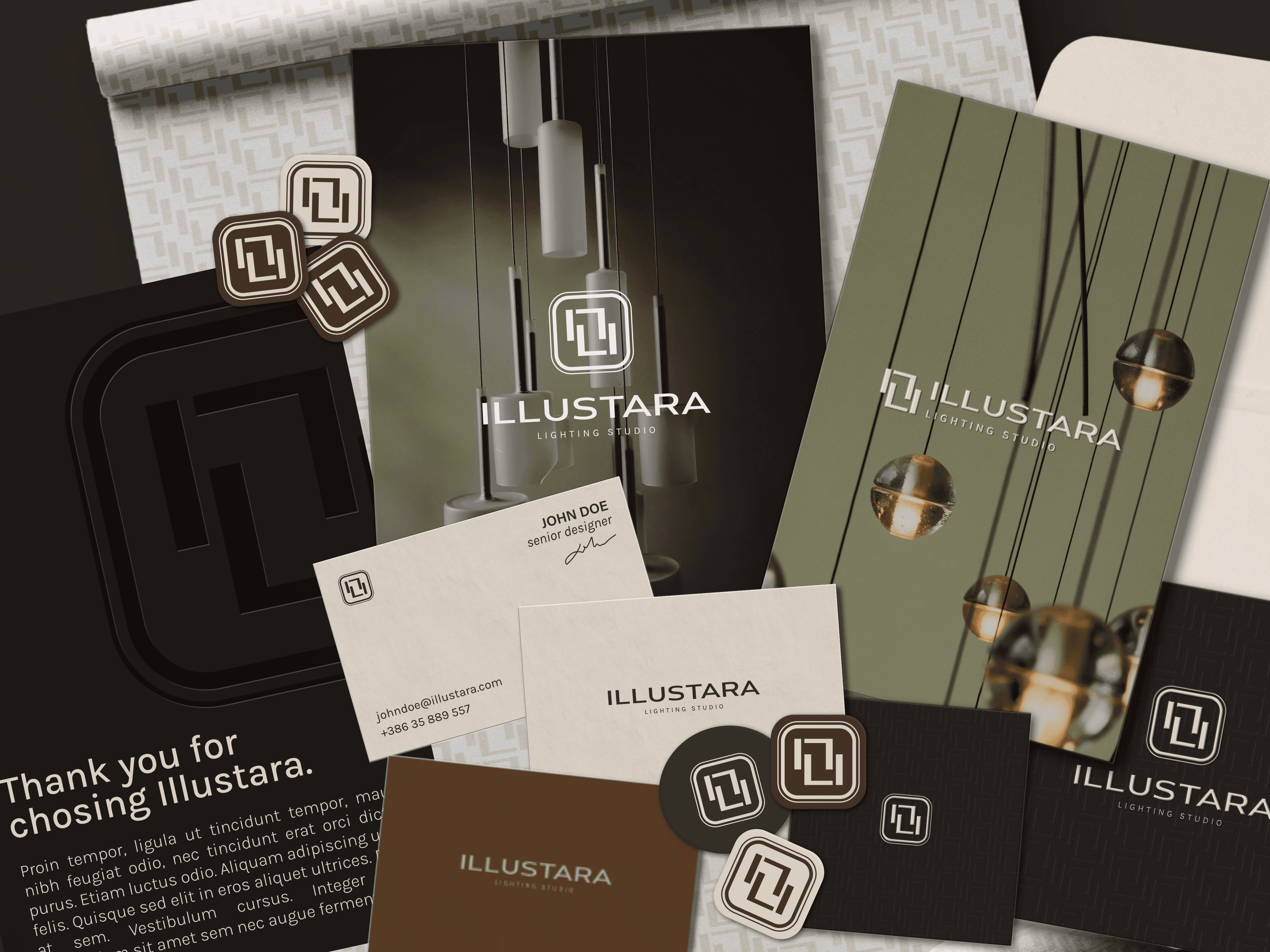
Multiple logo variations tailored for different uses. Primary logo: full version with name and symbol, ideal for larger spaces. Secondary logo: compact horizontal version for smaller or narrow spaces. Wordmark: simplified logo without symbol for versatile placement. Submark: symbol-only version for social media, stickers, and small prints. Icon: minimal symbol for favicons and very small spaces.
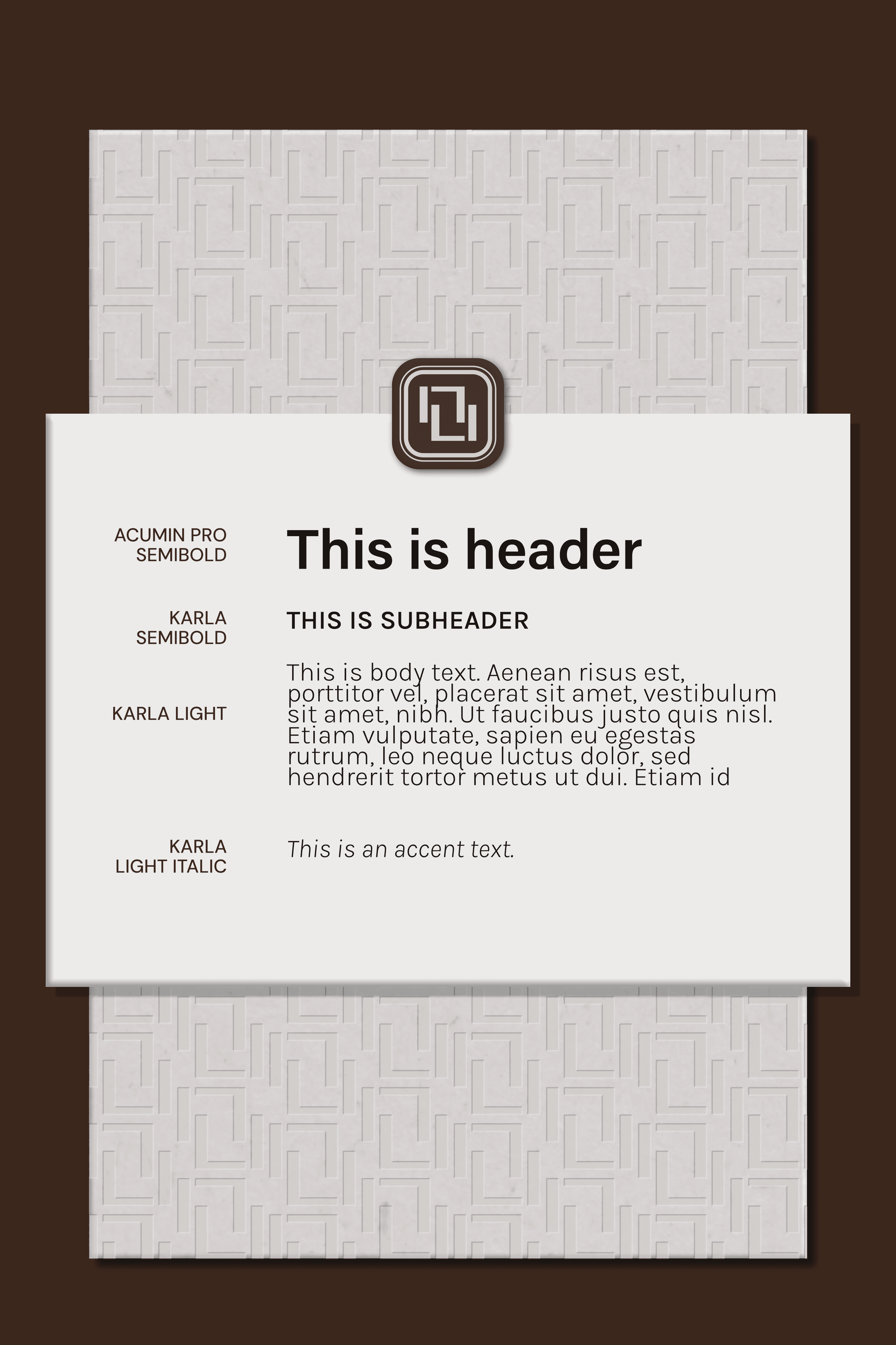
A well-defined & flexible typography system. Primary font: Acumin Pro Semibold, used mainly for titles. It complements the logo font while keeping the logo prominent. Secondary font: Karla (Light for body text, SemiBold for subtitles). A modern, readable sans-serif that matches the logo’s style and works well for longer text. Tertiary font: Karla Light Italic and SemiBold for emphasis and highlights, used sparingly to draw attention without disrupting overall harmony.
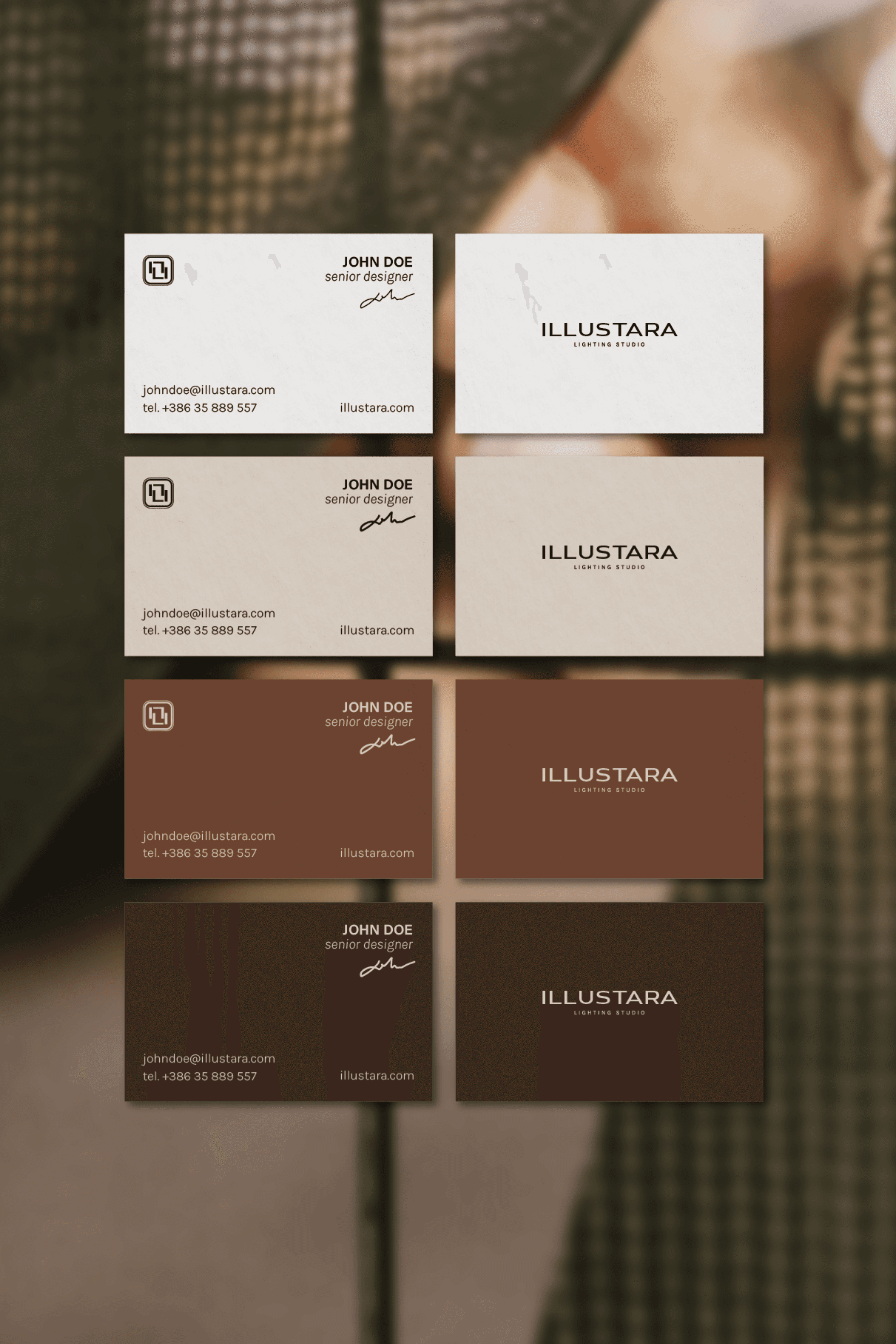
Color system that reflects brand’s products. Primary colors: Brown and beige form the brand’s core, used most frequently across materials and packaging. Secondary colors: Gold and silver used sparingly as accents to add elegance. Neutral colors: Charcoal black and off-white for backgrounds, typography, and balance, softer than pure black and white.
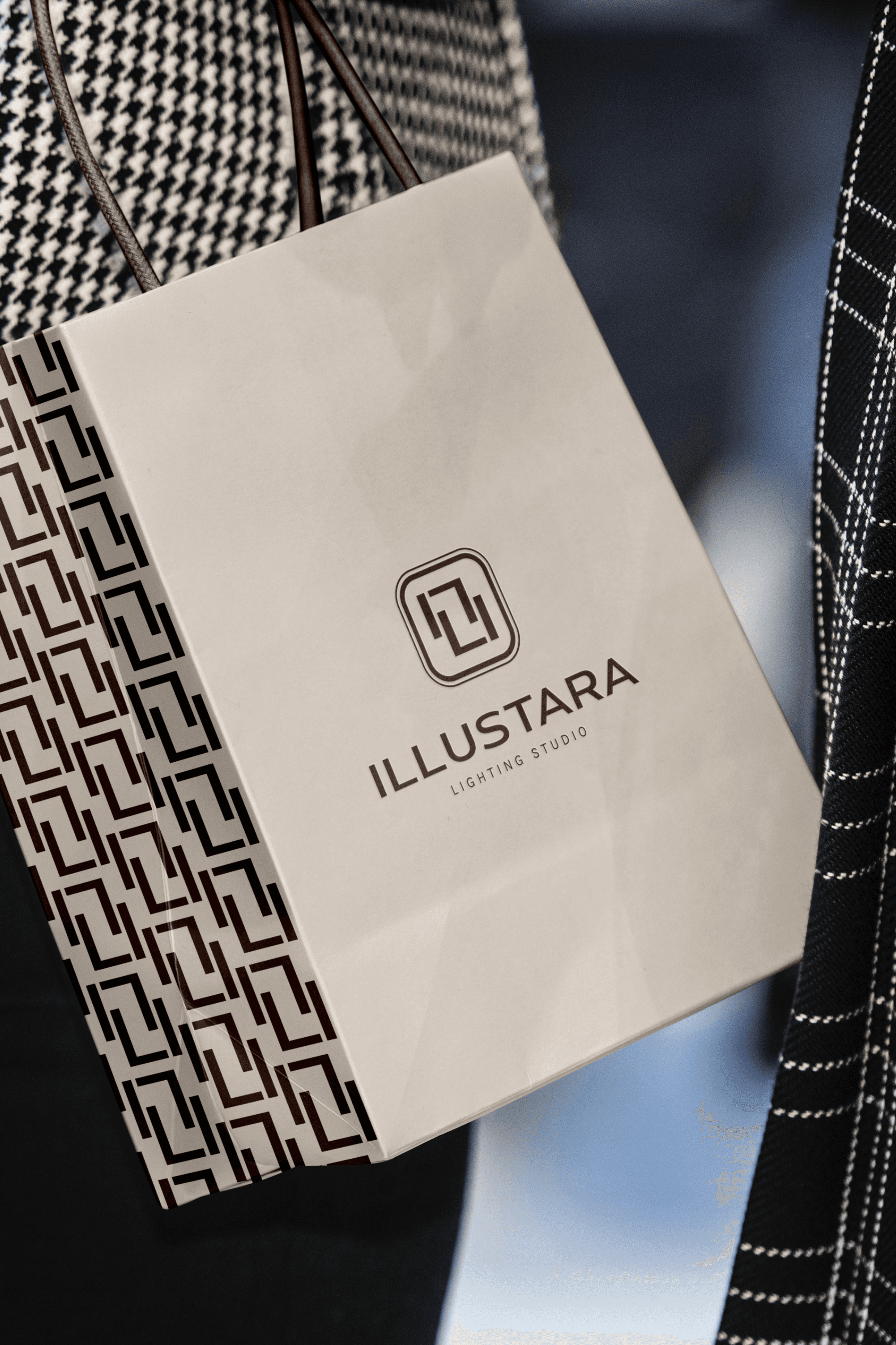
A branded pattern that features a secondary icon created from the initials of “Illustara". It may appear as a background on print materials, packaging, and digital platforms.
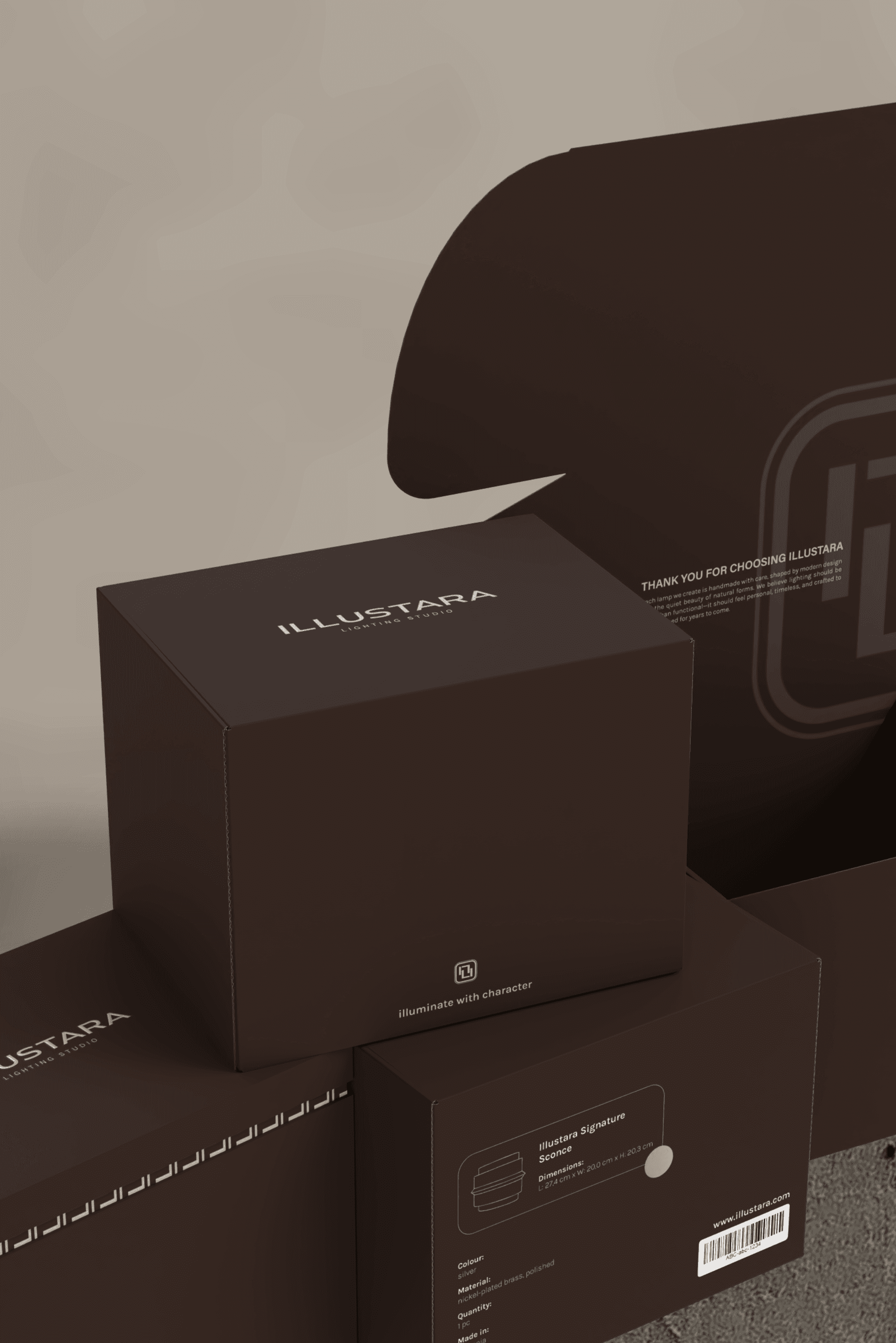
The packaging designed in two versions: a premium box and a standard foldable box. The premium packaging focuses on user experience, featuring a box with a lid, a dry-embossed logo, and a thank-you card with an envelope. The standard packaging is optimized for bulk orders where premium packaging would be wasteful. It is designed as a foldable cardboard and includes printed thank-you message inside. The design allows easy storage with key product info (barcode, sketch, color) on one visible side for quick identification in warehouses.
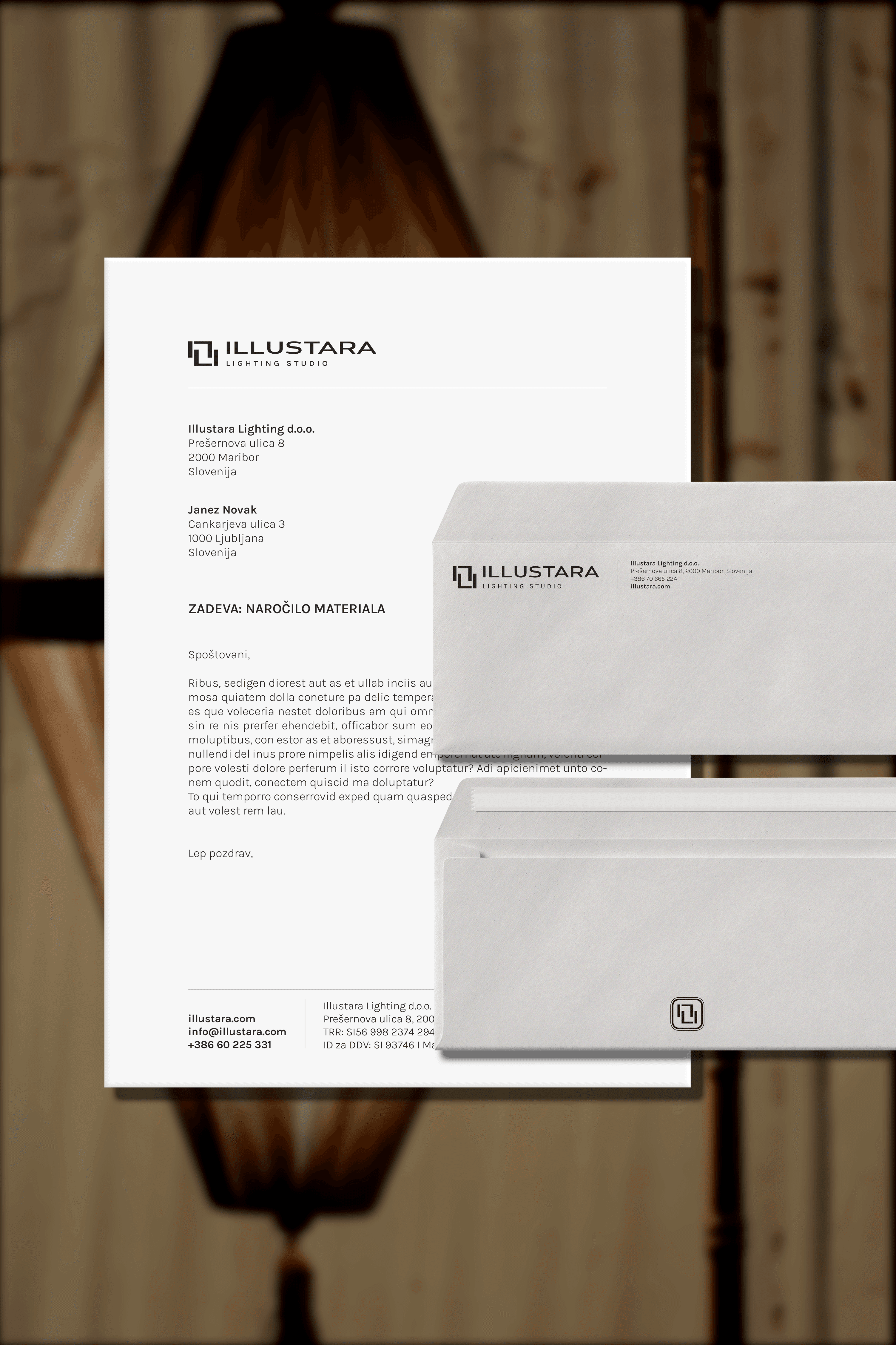
The letterhead and envelope include all key company details, arranged with clear margins to keep the layout clean despite dense text.
The business cards that are designed in the classic 85mm x 55mm format and include essential contact information.
Brand elements were also shown on various applications—both large formats (van stickers, awnings) and smaller items (stickers, gift bags)—demonstrating that the logo works effectively across different uses.
An extensive branding guideline was created, covering details like allowed and prohibited uses, safety space, and size limits for each logo variation. Due to its technical nature, it is not included here.
implemented solutions
WHAT HAS BEEN DONE
Tailored branding elements and practical packaging designs were developed to embody the brand’s luxury and functionality across all touchpoints.
Multiple logo variations tailored for different uses. Primary logo: full version with name and symbol, ideal for larger spaces. Secondary logo: compact horizontal version for smaller or narrow spaces. Wordmark: simplified logo without symbol for versatile placement. Submark: symbol-only version for social media, stickers, and small prints. Icon: minimal symbol for favicons and very small spaces.
A well-defined & flexible typography system. Primary font: Acumin Pro Semibold, used mainly for titles. It complements the logo font while keeping the logo prominent. Secondary font: Karla (Light for body text, SemiBold for subtitles). A modern, readable sans-serif that matches the logo’s style and works well for longer text. Tertiary font: Karla Light Italic and SemiBold for emphasis and highlights, used sparingly to draw attention without disrupting overall harmony.
Color system that reflects brand’s products. Primary colors: Brown and beige form the brand’s core, used most frequently across materials and packaging. Secondary colors: Gold and silver used sparingly as accents to add elegance. Neutral colors: Charcoal black and off-white for backgrounds, typography, and balance, softer than pure black and white.
A branded pattern that features a secondary icon created from the initials of “Illustara". It may appear as a background on print materials, packaging, and digital platforms.
The packaging designed in two versions: a premium box and a standard foldable box. The premium packaging focuses on user experience, featuring a box with a lid, a dry-embossed logo, and a thank-you card with an envelope. The standard packaging is optimized for bulk orders where premium packaging would be wasteful. It is designed as a foldable cardboard and includes printed thank-you message inside. The design allows easy storage with key product info (barcode, sketch, color) on one visible side for quick identification in warehouses.
The letterhead and envelope include all key company details, arranged with clear margins to keep the layout clean despite dense text.
The business cards that are designed in the classic 85mm x 55mm format and include essential contact information.
Brand elements were also shown on various applications—both large formats (van stickers, awnings) and smaller items (stickers, gift bags)—demonstrating that the logo works effectively across different uses.
An extensive branding guideline was created, covering details like allowed and prohibited uses, safety space, and size limits for each logo variation. Due to its technical nature, it is not included here.
are you
interested in working with me?
I am currently building a pre-launch mailing list, where all interested will be notified first about the launch as well as get the hold of special offers (and by special I really mean special!).
Any questions? Feel free to reach out:
Any questions?
Feel free to reach out!
hello@adornobranding.com
adornobranding
